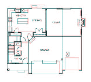
I recently had a question from a reader asking how the first floor of our home is laid out. In particular, she was interested as to where our cubby and bench area was in relation to everything else. I agree, it’s hard to show in photos sometimes how things “flow” around here, so I’ll attempt to give a better glimpse. For starters, here is our floor plan. (Ignore the fact that the room labels are backwards, I had to flip the image of the plan so that it is like ours, with the garage on the right side.)
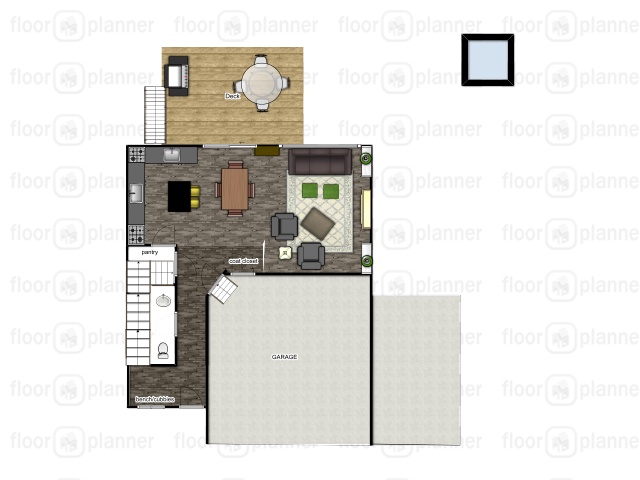
Now, ignore the crazy colors here and my not-so-drawn-to-scale skills, and here is a snapshot of the first floor when I was virtually arranging furniture in a floor planning program, prior to the move-in. (Do you like how it shows that we have two kitchen sinks? Not true haha…just a very unskilled user putting this together!)
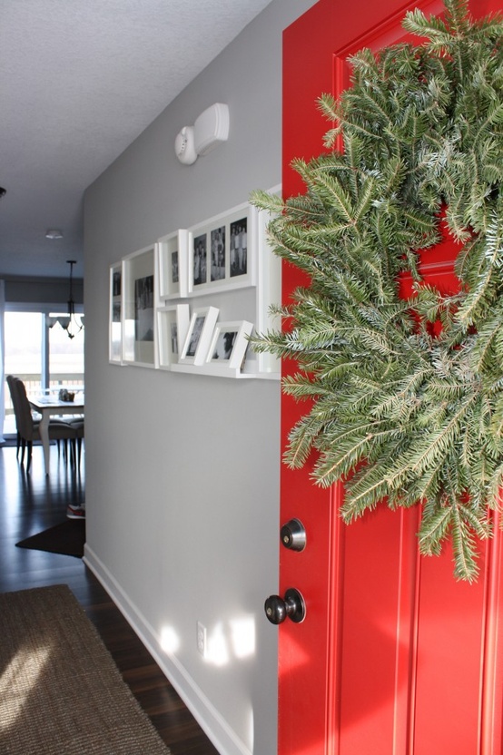
 So now, I’ll try and take you on a virtual walk-through. Come on in…(no, that wreath really isn’t there right now, but this was the last shot I had on hand – from December – of the front door entry).
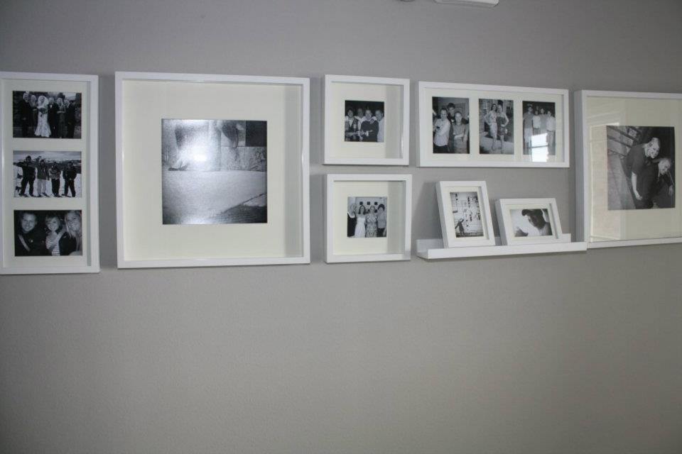
When you walk in the front door, you can head one of two directions. The first is straight down the hallway (past our photo wall)…
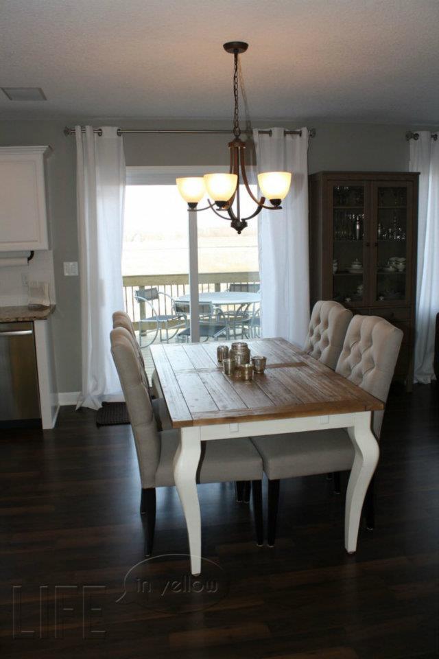
…and into the kitchen/living area which is all one room and makes up our first floor.
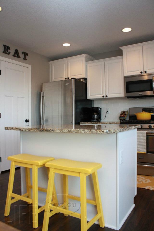
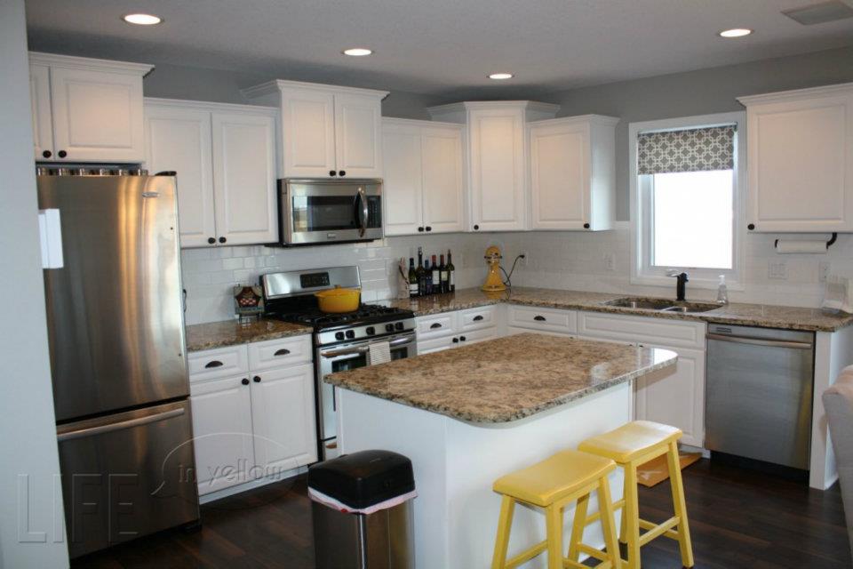
With no formally created dining space, we opted to float our table and chairs in the open space between kitchen and living area. To the left of the table, out of the previous shot, is our kitchen…
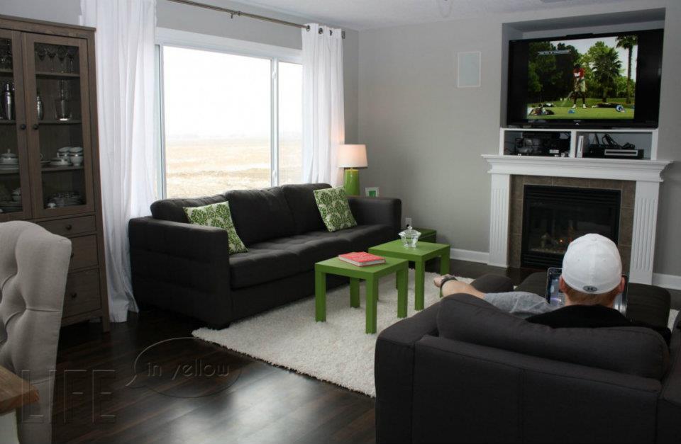
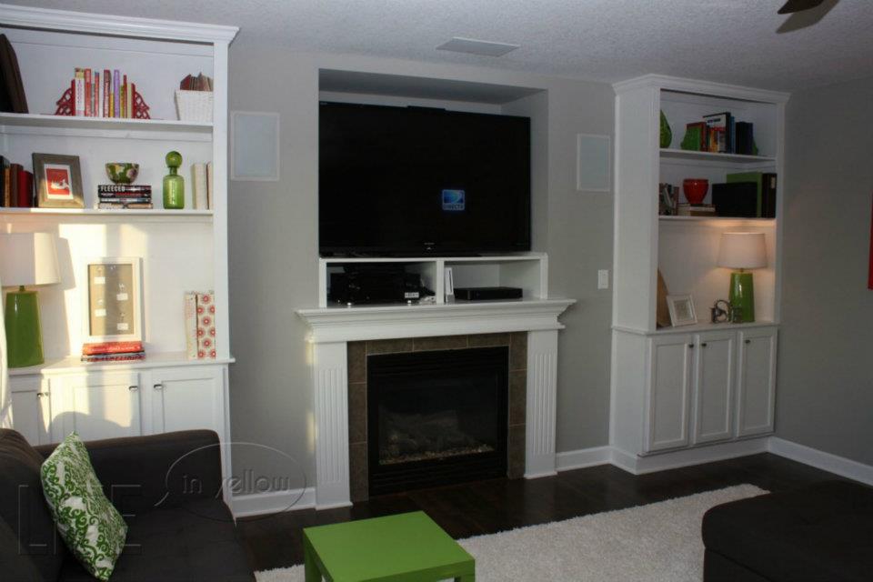
…and to the far right, on the other side of the table is our living area….
(again, not a recent photo of the living room, here it is, in all its post-bookcase glory)
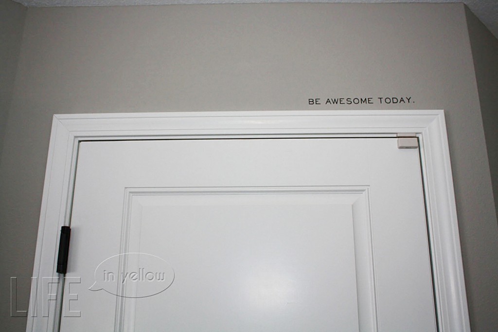
I didn’t know that it was worth a photo, but to the right of that chair that Page is sitting in (and trying to ignore my camera) is a coat closet, and just around the corner from that is the door to our garage. You would pass it before you walk back down the hallway to the front door. And you would remember to be awesome.
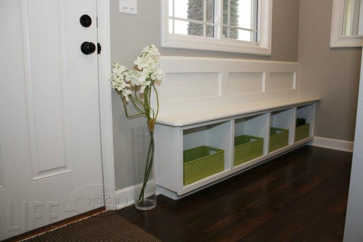
As for that cubby space, it’s along the front wall of our house, to the left when you walk in the front door, before you head upstairs to the second level…
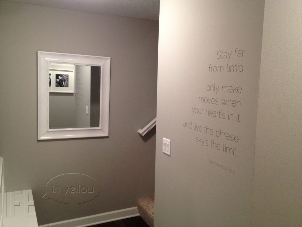
This built-in was one of my favorite details about the house when we first walked through a spec version…I’m all for ANY bonus storage spots, and so many times we or our guests perch on that bench to get shoes on or off. If you were to turn away from this wall unit, you’d see our beloved rap lyric decal on the opposite wall before heading upstairs.
So there you have it, our first level. You can see why we’re anxious to add some more living square footage space in the basement sooner than later, and we do spend a good bit of our time upstairs where there’s a little more room to sprawl out. But all in all, I do love how well this first floor seems to fit us right now.
Thanks for taking the tour – despite the hodge podge of photos from different seasons and times of day! 😉 You can view more in-depth posts about specific areas in our house by viewing our “house tour” posts. Thanks for stopping by!


Comments (3)
Hi. I love your house tour. I love the way you used neutrals with a pop of color in each room. It looks so clean and fresh. Stopping by from Lilluna linky party.
I am so impressed with the entire decorating of your home. Where did you find your kitchen table?
Thanks so much for your sweet comment, Lisa! The table and chairs are mixed and matched from World Market. Thanks for reading! 🙂